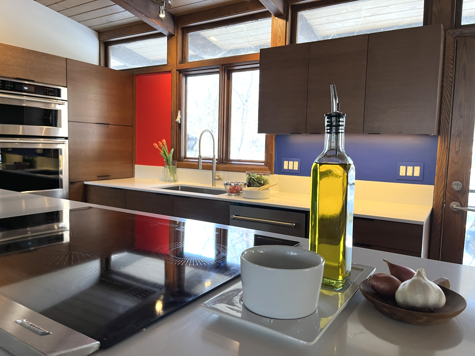
This cherry 1963 architectural home still had its original kitchen. While it was probably spectacular in its day, by today’s standards it was closed off and quite dark.
We removed a wall (that luckily did not go all the way up to the vaulted ceiling), and replaced it with a load-bearing peek-a-boo feature wall of oak and steel. We also replaced a solid door and vertical lite with a custom wide, full lite door. This brought light and sight lines from the front of the house to the back.
We took great care to honor the 48-inch-on-center design of the windows and beams, which gives the whole kitchen a sense of order and intention. We contemplated what would be the perfect wood choice since all the house trim (and original cabinets) were oak. We decided on rift sawn red oak with a custom stain similar to light walnut. Rift sawn is a great way to get a simpler, more refined grain with oak. It was a great choice-the cabinets are beautiful, and still tie in to all the existing house trim.
In keeping with the snazzy innovations of the 60’s, the homeowner wanted a bar to raise out of a hidden cabinet at the push of a button. The design also includes a telescoping stove vent, a sleek induction cook top, double wall ovens, one that converts to a microwave, a pull-out pantry, and two appliance garages with hydraulic lift doors among other things. The hardware is intentionally subtle (because the colors are not)! All the lighting had to contend with a solid wood vaulted ceiling so we used monorail throughout.
The project just wouldn’t be complete without the massive glass fronted “trophy case” where the homeowner proudly displays everything from his mother’s vintage cocktail glasses to thrift store kitch to finds from the family’s world travels.
I think one of the best things about Mid Century Modern is that our new modern feels right at home in it. After all, it was a time of embracing the future. And that will never get old.

